
Qt DESIGN STUDIO
Bring Your Designs to Life
Revolutionize your development process by bridging the gap between designers and developers to turn your design visions into production-ready UIs.
Try it Now Buy it NowTrusted By







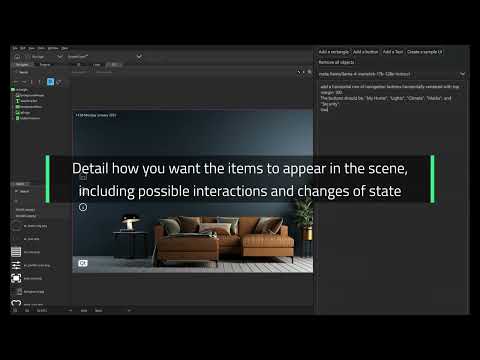
Compose UI Prototypes With AI Prompts
With Qt Design Studio AI Assistant, you can select the model and use prompts to generate a UI prototype in minutes. Detail how you want the components to appear in the scene, including possible interactions and changes of state. No need to know how to code or write QML.

Bring Figma Designs to the Product
Figma to Qt is the Figma plugin that helps you reduce iterations and ensures your design comes to life. Catch design issues early, align design and code, and export working QML code for developers to import into their preferred tools.

Effortless UI Workflow
Build and hand off UI projects to developers with ease. You can accelerate UI development with pre-built, optimized components, and our developer-friendly project structure that enables a smooth handover.

Unleash the Power of 3D
Create cutting-edge 3D HMIs for embedded software through our comprehensive workspace and powerful graphics pipeline that enables integrated 2D and 3D HMI development for high-performance embedded applications.
Try Qt Without Installation
Right in Your Browser!
Explore Qt’s power in your browser with no downloads. Test and edit demos, see its potential, and bring your ideas to life!

Qt Design Studio 4.8.1
Following the performance and stability improvements introduced in 4.8, this new version features the Qt Design Studio AI Assistant. Check out the updates!
Success Stories

Keurig saves 1-month of development time with Qt Design Studio and Qt for MCUs.

Verge has built a superior riding experience in just six weeks with Qt Design Studio.
.webp)
Gruppo Cimbali leveraged Qt's commercial offering to efficiently deliver beautiful UI applications, seeing great potential in integrated QA and testing tools.

Camtronics builds camera systems for sewer pipe inspection. Qt Design Studio successfully transferred design vision from design tool & enabled rapid prototyping without disrupting existing workflow.

CTE doubled the speed of designer-to-developer handoff and reduced validation time by 30%.

UX-FLO is a UI modernization service provider. They overachieved their development target by 63% by using Qt Design Studio and QML to communicate between designer and developer.
Learn Qt Design Studio
In our Learning Center, you will learn what Qt Design Studio is and how to get started with it.
Licenses
Qt Design Studio Community Edition
INCLUDES:
All Open-Source Qt Design Studio features
Four freedoms of Open-Source
- Run the program as you wish, for any purpose
- Study how the program works and change it so it does your computing as you wish
- Redistribute copies so you can help other open-source users
- Improve the program and release your improvements to the public so that the whole community benefits
These four degrees of freedom are absolute and non-negotiable. One cannot enjoy freedom without offering it to others, thus, freedom is also an obligation.
Must comply with Open-Source terms and conditions (GPL and LGPL)
BEST FOR:
Open-source projects, hobbyists and internal research. Making your software freely available to the public and allowing others to modify, distribute, and use your code, per Open-Source obligations.
Qt Design Studio Professional
INCLUDES:
Named Developer License
All Qt Design Studio Professional features
Only commercial terms and conditions apply
BEST FOR:
Designing and composing basic GUIs
Qt Design Studio Enterprise
INCLUDES:
Named Developer License
All Qt Design Studio Enterprise features
Bridges for common design tools (Figma, Adobe XD, Adobe Photoshop)
Only commercial terms and conditions apply
BEST FOR:
Designing and composing with full designer end-to-end workflow
FAQ
Qt Design Studio is rich with features from customizable visual effects to 3D elements and more, enabling users to produce stunning UIs in record breaking times.
How do I get Qt Design Studio
Visit our download page or webshop to try Qt Design Studio. You can either request evaluation license or purchase the product directly.
Where do I get the Figma plugin?
The new plugin for Figma is called Figma to Qt. You can download Figma to Qt from the Figma Community, where you can also find the playground project and the user guidelines.
The previous plugin, Qt Bridge for Figma, is still available for download and will be supported until the end of 2028, as Figma to Qt will eventually replace it in the long run.
What is the difference between Enterprise and Professional licenses?
Both Professional and Enterprise licenses have 2D & 3D tooling and Standard Support package.
The Enterprise license contains more advanced functionalities such as Qt Bridge for Figma, Content Library, Simulink support and beta version of Multi-language editor.
Do I need additional licenses for Qt Design Studio?
If you already have Qt for Device Creation license (Professional/Enterprise) or Qt for Application Developer licenses (Professional/Enterprise), Qt Design Studio Professional license is included in the package.
If you need Qt Design Studio Enterprise license, you need a separate purchase.
Can I deploy projects with Qt Design Studio?
No, Qt Design Studio projects don’t have a deployable runtime. You can validate the user interface with the Qt Design Studio but you need a license for compatible Qt version to deploy the project.
Qt Design Studio Community Edition can be used with open source version of the Qt only. All other licenses allow usage of commercial Qt version.
How long is the evaluation?
The evaluation is granted for 10 days. You can either continue with our sales representative or visit webshop for purchase.
Latest News on Design Tools

Introducing Figma to Qt: The Fastest Way to Bring Figma Designs to the Product
Let’s talk about Figma to Qt — the plugin that closes the gap between ...

Atomic Design Systems: Why the Labels Don’t Matter
Atomic design systems have emerged as a methodology for creating scala...

