QA Logo
The QA logo is part of the Qt Group brand system and follows its visual principals. This section shows the logo and provides guidance for how to use it across all applications.
Logo
The QA logo consists of the Qt logo mark and a wordmark spelling Quality Assurance. The Quality Assurance wordmark is using the Semibold cut of Qt brands corporate typeface, Titillium Web.

Color Variations
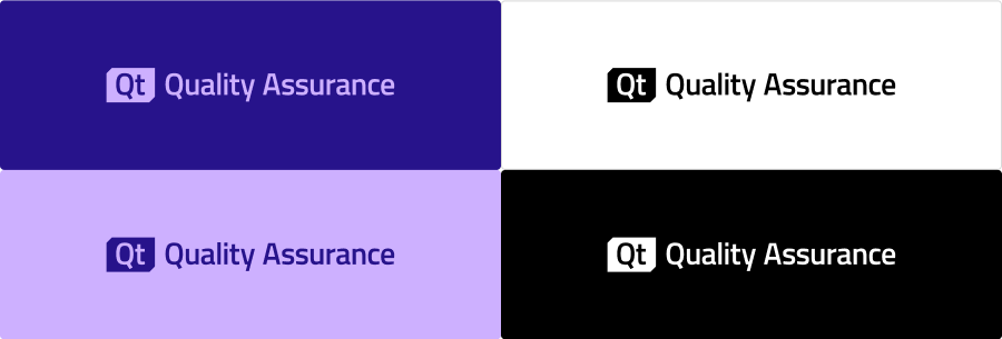
The primary color variations of the logo are using the QA brand colors. You can place the logo in Violet against Midnight background, or in Midnight against Violet background.
Use the black and white logo variations on photo backgrounds or when brand colors are not available.

Minimum Safe Area
To ensure the visibility of the QA logo, we surround it with a minimum safe space. Make sure that this area always stays clear from other logos or graphical elements.

Placement
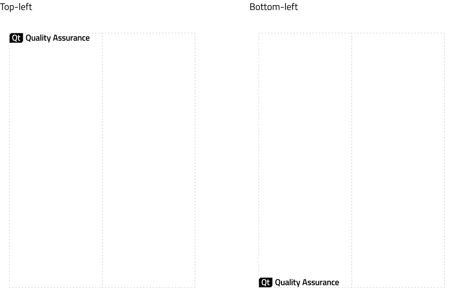
When creating layouts for different applications, aim to leave the left side more or less empty, with space for the logo to be aligned either to the top-left or bottom-left corners.
The logo shouldn’t span across more than half of the width of any application.

Placement On Imagery
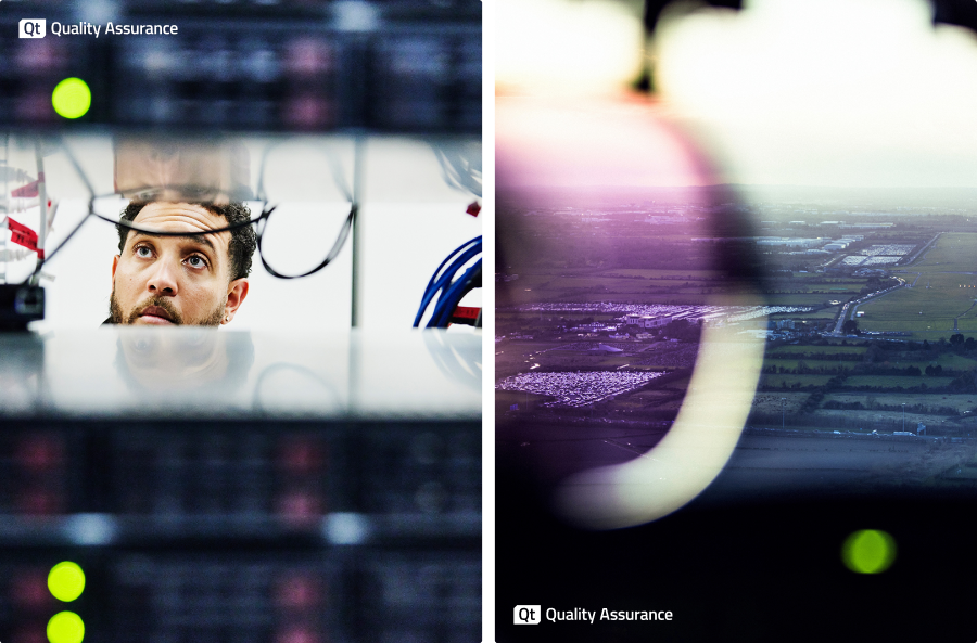
It is allowed to place the black and the white version of the logo on top of imagery for as long as the following conditions are met:
- the surrounding area is calm and simple
- the surrounding area has sufficient contrast, meaning black logo on light background and white logo on dark background

Don't Do
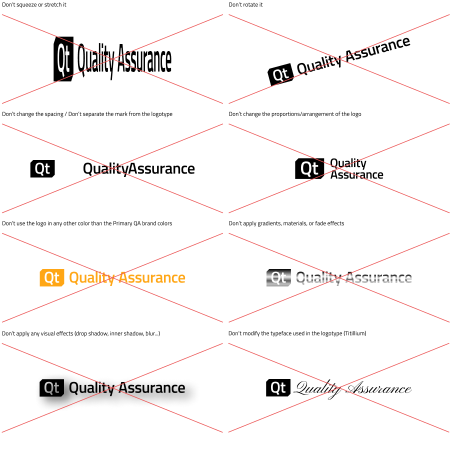
Always use the logo in its original form. Modifying the logo is forbidden in any of the following ways.

.webp)
