Qt Group Logo
The Qt Group logo is a part of the Qt Group brand system and follows its visual principles. This section introduces the logo and provides guidance on how to apply it.
Use the Qt Group logo when referring to the company. The logo should be used for example as a letterhead on the website, in investor relations, in employer communications and in contexts where the multi-product offering is introduced.
Logo
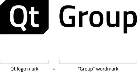
The Qt Group logo consists of the Qt logo mark and the wordmark “Group”. The Group wordmark is using the Semibold cut of the brands typeface, Titillium Web.
Color Variations
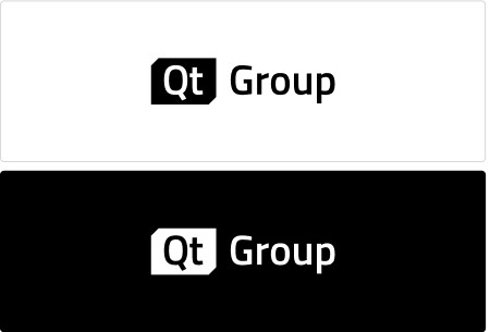
The primary colors of the Qt Group logo are black and white. Use the black and white logo also on top of photos and other imagery.
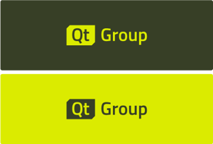
As a secondary color option, you can use the Qt Group logo in Lemon against Moss background, or in Moss against Lemon background. Note: this use case is limited to specific marketing materials only, please contact the brand team.
Minimum Safe Area
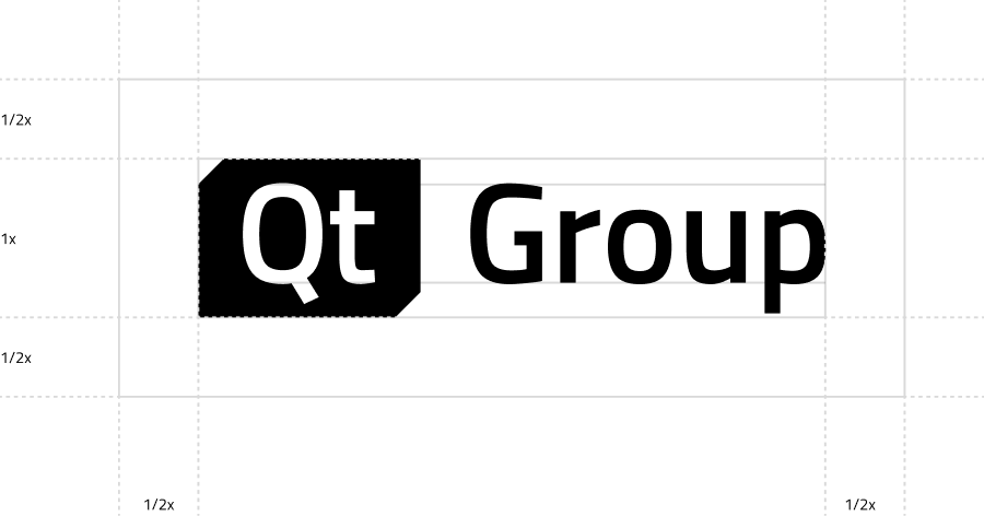
To ensure the visibility of the Qt Group logo, we surround it with a minimum safe space. Make sure that this area always stays clear from other logos or graphical elements.
Placement
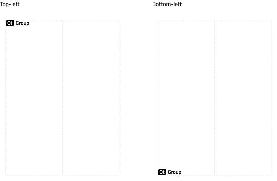
When creating layouts for different applications, aim to leave the left side more or less empty, with space for the logo to be aligned either to the top-left or bottom-left corners.
The logo shouldn’t span across more than half of the width of any application.
Placement On Imagery
It is allowed to place the black and white logo on top of images as long as the following conditions are met:
- the surrounding area is calm and simple
- the surrounding area has sufficient contrast, meaning the black logo on a light background or the white logo on a dark background

Don't Do
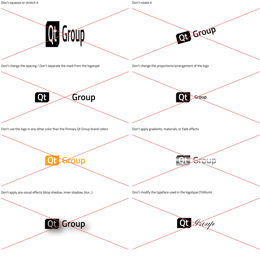
Always use the logo in its original form. Modifying the logo is forbidden in any of the following ways.
.webp)
