Event Guidelines
The Qt Group participates in several trade shows and commercial events every year, all over the world, to publicize our latest offerings for both Qt Development and Qt Quality Assurance products. Below you can find guidelines for designing the event booths and all related visual materials on display at those events.
Taglines, Messaging
The event booths usually have one or two taglines and additional messaging on display. We have specific taglines for each of the Qt product areas and industries, please check the most recent ones on display at our web pages at Qt.io. Some examples are also below:
Qt Group: The Future of Digital Experiences
Qt Development: Create More. Code Less. Deploy Everywhere.
Qt Quality Assurance, Tools: Analyze. Automate. Accelerate. Assure Quality.
The additional messaging varies, depending on the target industry and target audience of the event. To craft the most compelling messaging please take a careful look at our Tone of Voice (ToV) guidelines, here: https://www.qt.io/brand-internal/tone-of-voice
Important Reminder: We follow Title Case for headlines on event booths which can be reviewed as follows:
Title Case refers to writing text with the first letter of every word capitalized, except for certain
words such as articles (a, an, the) and conjunctions (and, but, or), see more examples below. Using title case, any word immediately preceding a hyphen should be capitalized. The word following the hyphen is capitalized, unless it is an article, preposition, or coordinating conjunction. (e.g. Fight-or-Flight, or Future-Proof)
Here are some more guiding factors:
• The first word of the title or heading, even if it is a minor word such as “The” or “A”
• The first word after a colon, em dash, or end punctuation in a heading major word, including
the second part of hyphenated major words (e.g. High-Performance)
• Words of four letters or more (e.g., “With,” “Between,” “From”)
• Lowercase only minor words that are three letters or fewer in a title or heading (except the
the first word in a title or subtitle or the first word after a colon, em dash, or end punctuation in
a heading):
• Short conjunctions (e.g., “and,” “as,” “but,” “for,” “if,” “nor,” “or,” “so,” “yet”)articles (“a,” “an,”
“the”) and short prepositions (e.g., “as,” “at,” “by,” “for,” “in,” “of,” “off,” “on,” “per,” “to,” “up,” “via”)
Brand Imagery and Colors
All of the official brand images and colors for each product can also be displayed at events, as long as they are used within their original context.
So if we are presenting multiple Qt Products at the same event booth we should create separate sections within it for each product. For example, in the section where the benefits of using Qt Development are mentioned, the official Qt Development images and Qt Development colors (Neon, Pine) should be used. Then, on the adjacent panel or section where the benefits of using Qt Quality Assurance tools are mentioned, the correspondent official Qt QA images and Qt QA colors (Violet, Midnight) should be used.
On the other hand, if an event is focused on Qt Quality Assurance alone, then the whole both should be displaying Qt Quality Assurance brand images and colors (Violet, Midnight), as well as the QA Pattern.
Concrete examples are described and shown below.
Booth Design, Multiple Products
In the case of presenting multiple Qt Products, the use of the multiple brand colors should be restricted to just highlights on a predominantly white background and the weight of the visual contents should be well balanced, not highlighting one Qt Product more than the other. The use of unique graphic elements such as the QA Pattern and the Qt Development Frame is not allowed. Instead, the design should use the Qt Group Container shape as a unifying element for all the represented brands.
The visual coherence of the displays is also achieved by having enough white space in between the multiple brands, and by using black, white, or neutral grey on structural supporting elements such as beams, columns, info desks, and tables.
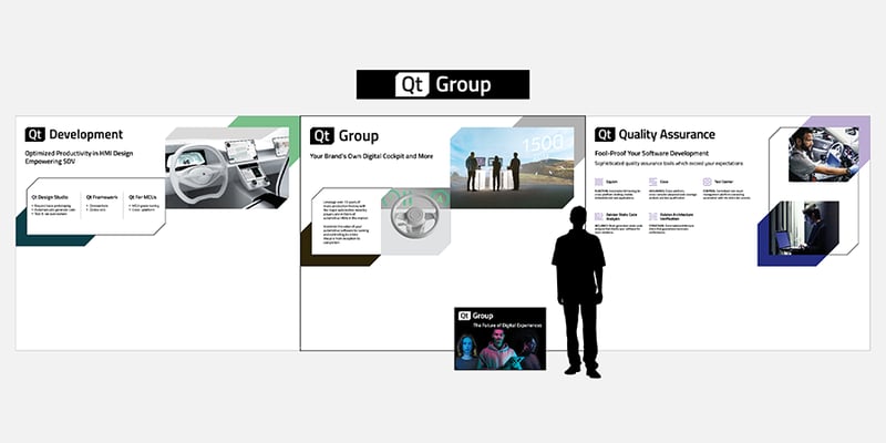
Multiple Product booth example from CAEV 2024, India:
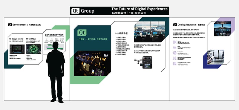
Multiple Product booth example from the Avionics International Forum 2024, China:
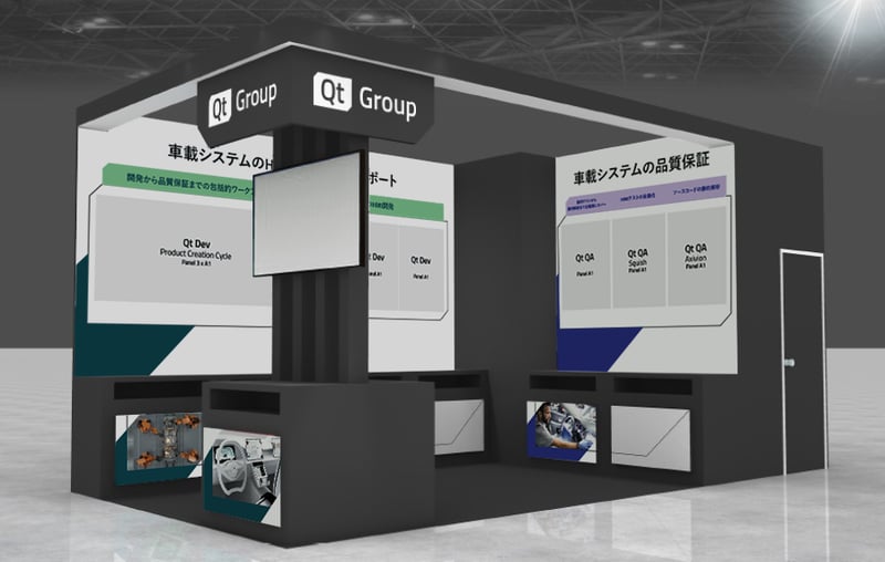
Multiple Product booth example from the Automotive Engineering Expo Yokohama 2024, Japan:
Multiple Product booth example from CES 2024, USA:
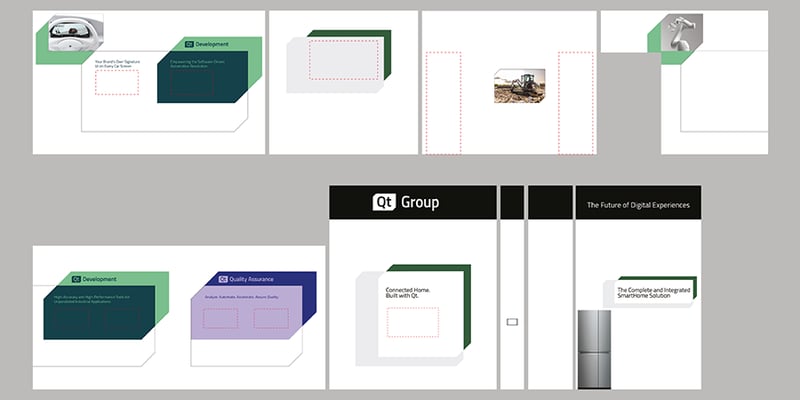
Multiple Product booth example from Bosch Connected World 2024, Berlin:
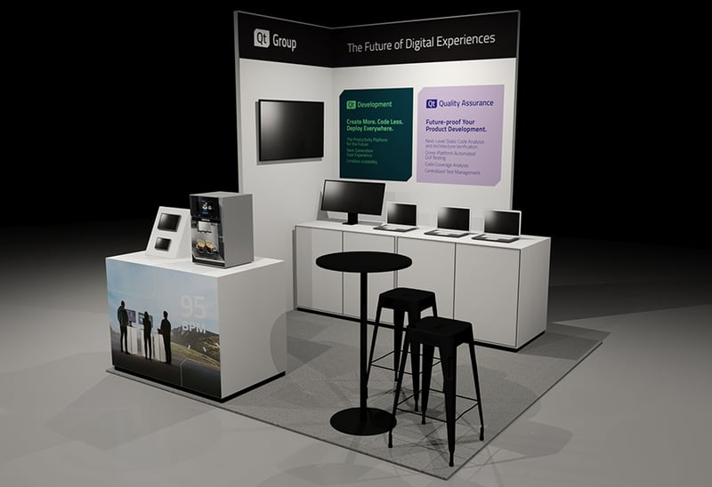
*Note that Future-Proof should be uppercase after the hyphen here.
Booth Design, Single Product - Qt Quality Assurance
The majority of events with a focus on just one specific product of the Qt Group portfolio are organized to promote Qt Quality Assurance. Therefore we should use its corresponding logo, brand colors (Violet and Midnight), images, and unique graphical element (the QA Pattern) exclusively. The Qt Quality Assurance brand is described in detail here.
However, on some special occasions, there may be a need to show the Qt Group logo alongside the Qt Quality Assurance. For example, if in the list of exhibitors we are named as Qt Group, it is advisable to also include a Qt Group logo on the booth walls. It should be well visible but not take a prominent position on the whole booth layout. We recommend placing it either above or on the side of the booth, against a neutral black background. No other Qt Group brand visual elements are necessary, the logo alone is sufficient.
Examples of booths from recent events are listed below:
Qt Quality Assurance booth example from Software Defined Vehicles Forum & AutoSAR China Day 2024, China
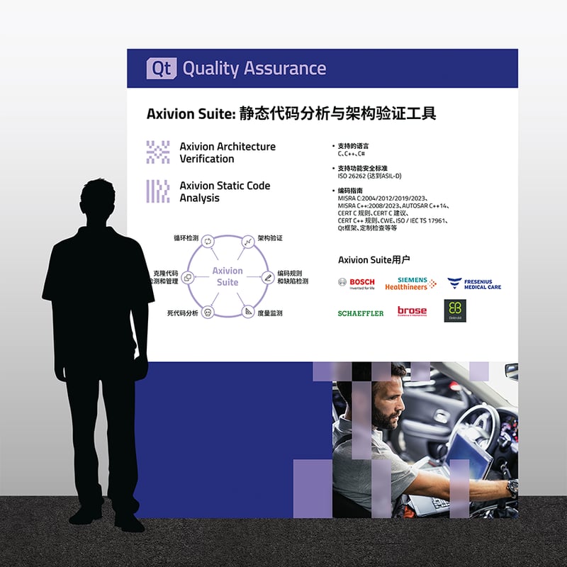
Qt Quality Assurance booth example from EuroSTAR 2024, Sweden
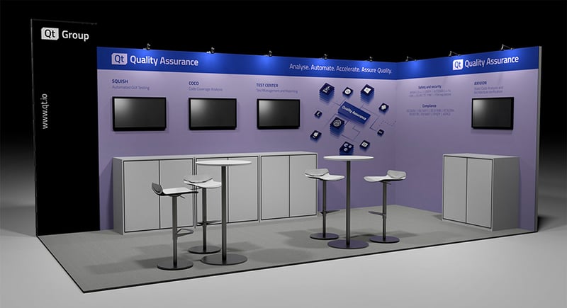
*Note that "Safety and Security" should have security capitalized here.
.webp)
