We are releasing new light and dark mode Qt Creator themes this year, and would love to hear some feedback from you!
Why do we do this?
Your feedback matters! We listened closely to your input from the Qt Creator Survey, and one thing was clear: it's time for a visual refresh. You told us that the current look and feel of Qt Creator felt outdated, with some usability issues. From bland colour schemes to cluttered views, we knew it was time for a change. We also received valuable feedback about various features, which we're actively researching to address in future updates.
We value your input more than anything and feedback will help us continue to improve and refine Qt Creator to meet your needs.
What are we changing?
-
Added more contrast with new background and foreground colours.
-
Changed the green accent colour to a calmer and more modern one.
-
Optimised spacing to embrace a minimalist design philosophy.
-
Updated components like the buttons for a more modern versions and added states for hovering and pressing.
-
Aligned icons with the Qt Creator design system, which is flat, minimal and outlined.
-
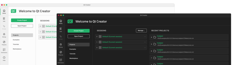
Visual facelift & usability improvements for welcome view:
-
We highlighted the main actions such as creating and opening projects with large buttons.
-
We made the side menu for navigating to Projects, Examples, Tutorials and Marketplace, to look more like a menu rather than buttons.
-
We relocated important links from the bottom of the screen to the menu, to enhance their visibility and accessibility.
-
We've revamped key UI elements like cards, search field and combo boxes.
-
Take a moment to explore design images of the new themes below and let us know what you think?
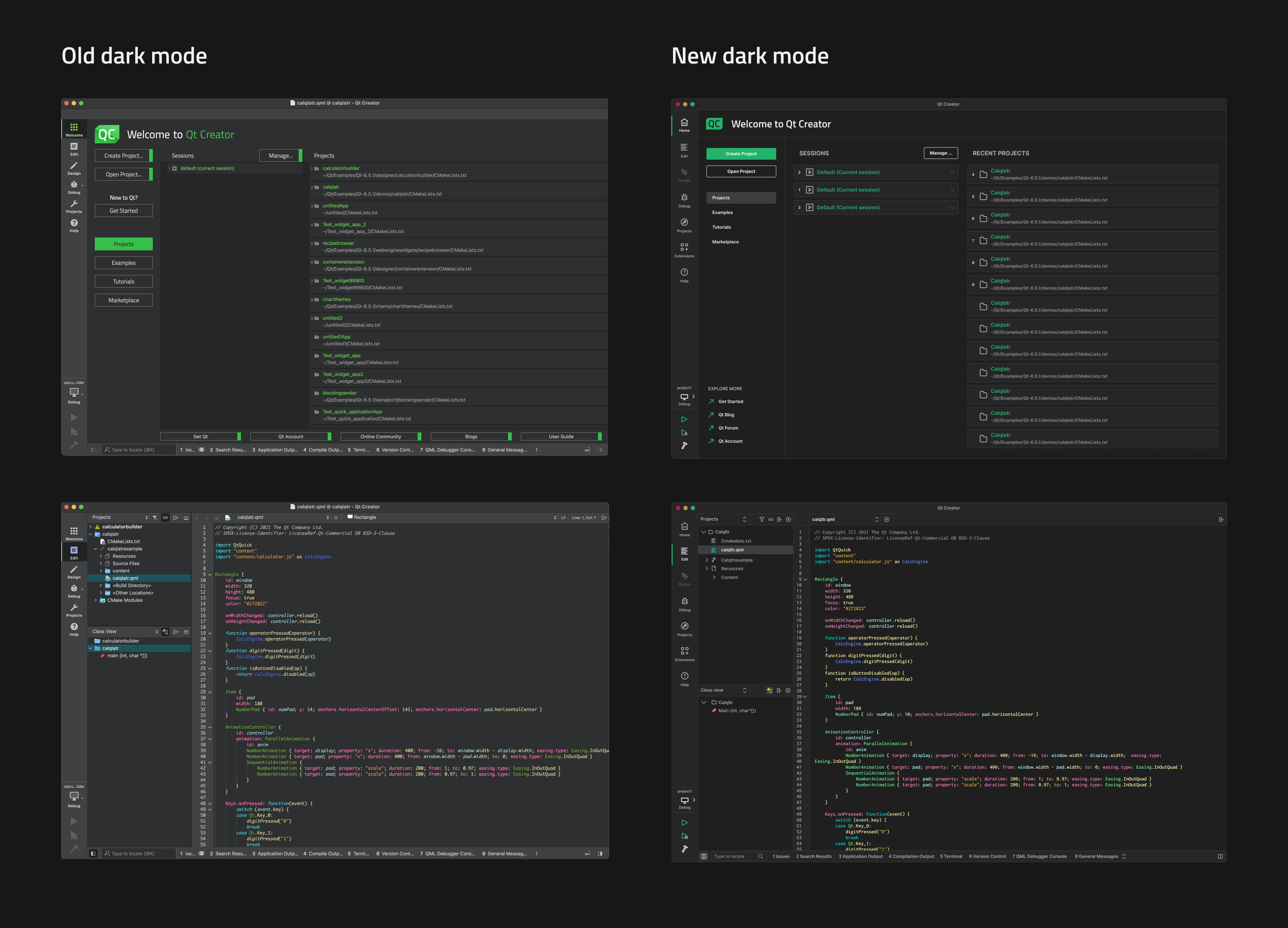
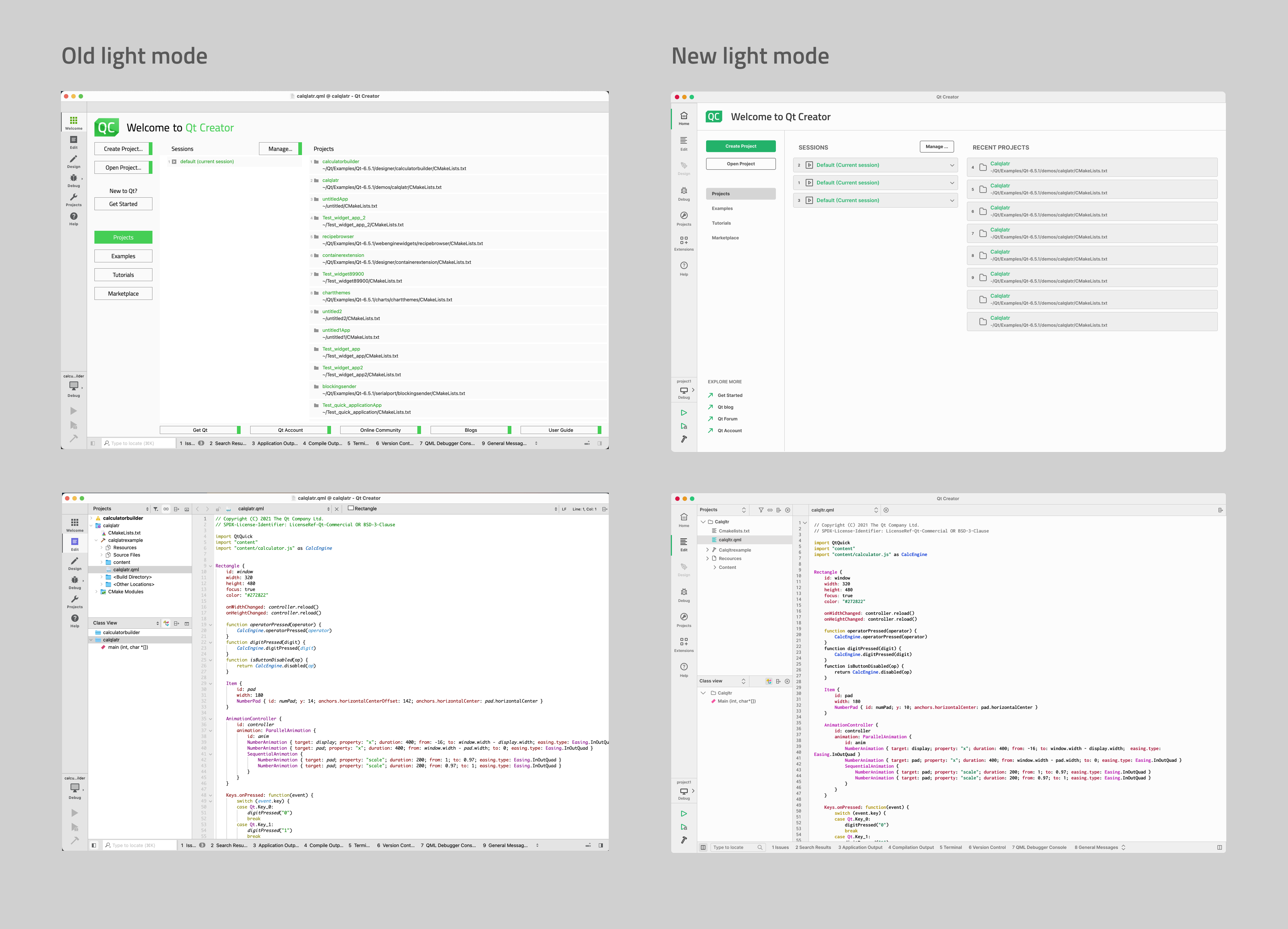
Note: The images displayed only represent our current design and the final product may vary.

Commenting for this post has ended.
Please leave the old themes available. I think the current dark theme is just about perfect, and I don't want more contrast.
As for me - "The best interface - is no interface". I would like to see code as much as possible and tool- menu- etc- bars as less as possible, (it can be an analog of Command Palette of VS Code) as well as to forbid build or output panel to annoyingly popup when it not needed to me. Of course it's more a question of usability than of a graphical design. It would be great to have a possibiliy to customize font size of ffie or project panels , and locator menu - they look too small on my fullhd laptop, and dpi option doesn't help at all.
same on my Apple Monitor (and my old eyes ;-) - current text is too small would be really great to customize font size of Project Panel etc. same way as I can do with the Editor
(Unit-) Tests still are well hidden. Although for modern workflows they should be first class citizens in the IDE.
Some easy to implements suggestions to improve a little bit:
* Move the menu "Tools -> Tests" to a separate Menu in the main menubar (next to Debug/Analyze).
* Add a "Run all tests" button in the left bar (next to the run/debug/build buttons).
* Have the tests panel active by default
Looks real good!
Would be great to have an option to detach and move bottom output panels ("Issues", "Search results", etc) to another Window (and another screen), so they don't jump out during build or when an application stars.
+1
I find the new dark theme very similar to what I get with Creator when I set up the current dark theme + KDE's black theme. And yes, they interfere with each other, Creator not always properly applying the correct color scheme. Yes, I know, I might be asking too much, but at the end of the day that is just my normal desktop.
I'd rather stick with the old one. I don't want to be repetitive but I strongly agree with everything that has already been said: the contrast is too strong in the new theme, the side and top bars are too big.
Some comments found some goodness in the new design, saying that it looks more modern. For me it's the opposite: I don't like the shade of green in the old one's accent but the idea behind is pretty good, and it's more unique. I always thought that the old theme was almost perfect. Adding an option to customize the accent is what I would definitely call an improvement, not replacing the entire style with one with higher contrast.
Yay. I'd also like to make backgrounds pitch black as well (not only in text editor) At least while I don't have OLED monitors everywhere. 😅
IMO qtcreator themes were much better back in the days of qt3, you can create a stable theming api and forget about this problem forever, community will create a lot of professionally designed and good looking themes instead of this flat misunderstanding without visual dividers
The new dark theme looks awesome but the left sidebar is too wide for me, it takes a lot of space. I hope it will support View - Mode Selector Style - Icons Only. I also hope that icons in this left sidebar will be high-res or SVG because current icons aren't.
Another thing is that you are stating that: "Optimised spacing to embrace a minimalist design philosophy.", but if I look at the pictures then I see exactly the opposite, everything takes more space than in the old design, every box is wider and higher, I think padding could be decreased for 2px everywhere 😎, of course, it wouldn't looks so good as now but would be better for everyday work.
But I like this new dark theme a lot, very appreciated. Thx for this refresh. 👌
Thank you for your feedback. Especially the comment about the the sidebar was really valuable to us because we have been thinking if our users would like to optimise that space by hiding or minimising it.
Regarding to your comment about spacing. In these design images we used the relaxed toolbar spacing. In the current Qt Creator version we have two options for toolbar style: relaxed and compact. These options will be available also in the new design. You can find these settings in preferences>environment>interface>toolbar style.
We are glad that you liked the new dark theme. Thanks again for you comments 😊
For the new dark mode:
Good: New icons look fantastic, well done. Hopefully this extends to all screens in settings as well. The accent lines make it indeed look more modern like the other IDEs, I like it.
Maybe bad: the darker background for the code editor will take some getting used to. I can't judge right now, will need to try the application first.
General question : Are you looking into adopting QtQuick for QtCreator in some research project somewhere? I think QtCreator should go in that direction at some point or offer an alternative IDE much like how microsoft introduced VsCode because refactoring Visual Studio to a new UI technology was not feasible. If you look at the editor performance and experience for QtQuickEffectMaker, it's a joy to use on 240hz monitors.
The "neon style" icons are actually quite dated IMO, certainly not an improvement over the current.
I like the new color schemes but think it would be great if it was easier for third parties to contribute themes as well. It kind of points at problem in general at doing themes in a Qt application.
I think the left side toolbar should be removed completely, or at least editable. I never use the Help, Designer and very seldom use the Welcome button.
Another tool bar at the top especially for run/ debugging and setting the run mode (nod to VS here)
When in debug mode, the debug control buttons at the bottom are way to small, and should be put at the top.Often times I have twenty files open, some our QML others (.cpp & .h)
I Think it would be nice two have to file selection menus at the top instead of the current one. One for QML and JS , and the other for C++ files.
A tab area at the top would be nice , each tab containing a file you are editing and want quick access too.
You can disable the respective plugins and the buttons for them will disappear. First thing I do after a fresh install is to remove "welcome" and "designer" and pretty much every other bit of bloat I am not using.
Thank you David for the great comments. We will definitely consider making it possible to minimise or hide the sidebar. Also your comments about debugging and tabs are very valuable. We're doing usability improvements and research also to those features in the near future 😊
David is right about the debug control buttons being way too small. It also would be nice to have a easier way for removing unwanted modes from the modebar. Currently one has to find the help menu's plugins dialog and do some guess work their to get rid of unwanted modes.
Otherwise strongly disagree with David's opinions. I absolutely love the sidebar. It's a great tool for navigation. I really love its pop-outs for target configuration and submode selection; eventhough the debugger's submode selection could be done nicer and maybe more discoverable.
About tabs for each file on top: PLEASE NEVER EVER — Having avoided this noise and clutter they add is one of the unique design decisions that make QtCreator clean and easy to use. These tabs seen in so many other text editors and IDs really just waste space and distract in their randomness. QtCreator's way of just providing a combo box is so much nicer. People insisting on avoiding the combo box's extra click, or who prever to always see all open files can easily add the "Open Documents" view to the left or right side bar bar.
For David's proposal to have multiple comboboxes for multiple categories of files: How about keeping one list, but adding filters, or distinct open/popup buttons? Let's not clutter the with way too many tiny comboboxes fighting for screenspace!
You can disable the mode bar yourself: Views->Mode Selector Style->Hidden.
Hopefully this doesn't mean the modern trend of unnecessary white-space everywhere. Having a "compact" mode like CLion would be very nice.
It would be great if we had many choices for themes and color schemes within the editor, though that new dark theme does look good. Themes that use semantic tokens effectively so as to have subtle use of color and bold for different tokens of C++ would provide best clarity of code.
Is that really a priority? Are uses complaining about the styling? Because, speaking from some 20 years of graphics design experience, I can't say the new styling are an improvement. It is certainly lower aesthetically, although that may still be work in progress.
All in all, my opinion on the subject is "you better leave the current themes as an option". The new ones should be addition, not replacement.
I don’t think the new UI style is an improvement. If you make a flat design like vs code, like material or fluent, QtCreator will lose its own characteristics. I hope there will be more color gradients instead of Post an icon similar to awesome font, please find a new UI/UX designer to design it
Thank you for providing feedback. We understand your concerns about changing to more a simple and flat style. We will surely try to keep Qt Creator characteristics while making it more modern. Flat designs, are popular because they're simple and are considered to improve usability by minimising clutter and simplifying visual components, which can help users focus and work more efficiently. These design strategies often increase accessibility by prioritising clear hierarchy and readability, which improve usability, and user experience. Adding some colour gradients might be a good idea for some parts of the UI, but we need to of course make sure that any updates make it easy to use and understand.
The current UI is very good (as opposed to the chaotic interfaces of some other IDEs) and I can see several small but welcome improvements in the new design.
I can't see many major changes if not the extensions sidebar button (could be a nice idea, depending on what its purpose will be) so I don't see how older users would complain or ask to keep the old theme. Apart from some style changes (which are subjective but certainly not disruptive), some of the new icons (e.g. close panel) are much clearer now.
Thanks for your work. UI is probably not a priority in Qt Creator (as I said, it is already quite good) but improvements should always be welcome.
I'm using Qt Creator since its early days and I really, really hate it when I have to switch to VS because of its debugger (nothing compared to the CDB backend) or other IDEs more appropriate for other languages :) Working in Qt Creator is vastly easier IMHO.
Please fix the "scrollbar's handle is not visible in Dark theme" issue: https://bugreports.qt.io/browse/QTCREATORBUG-25707
Nice Looks!
One question about the designs: Is it intentional that all the local file navigation and information controls have disappeared? Like QML hierarchy navigation, file format information/selection, current cursor position? I really rely on these controls.
Hopefully you are testing your new designs on Linux that runs Gnome under Wayland. The current version of Creator has some visual glitches with frame alignment and padding in the settings. Also, the window decorations aren't very nice because under Wayland Gnome leaves window decorations up to the client, not the window manager.