This article explores the data analysis features of Squish Test Center, focusing specifically on the timeline, graph, and compare features. These features equip users with the ability to understand the status of their projects, track the health of their tests over time, and compare different test results to identify the most important test failures.
Project overview and result comparison
When many features are developed in parallel, it can be difficult to get an overview of the projects health. Test Center provides a project overview, that can be grouped by the most recent results for each active branch. In the project overview you can also see the name of each batch and the labels associated with it. The overview is very configurable, you can decide which labels should be shown, how many results are displayed, and whether the results should be ordered by execution time or upload time.
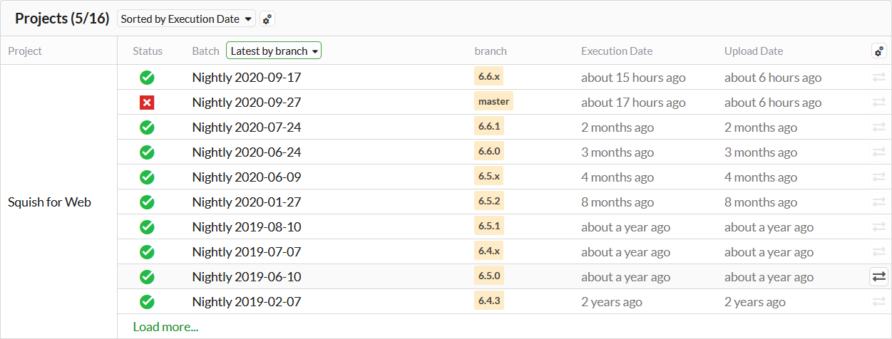
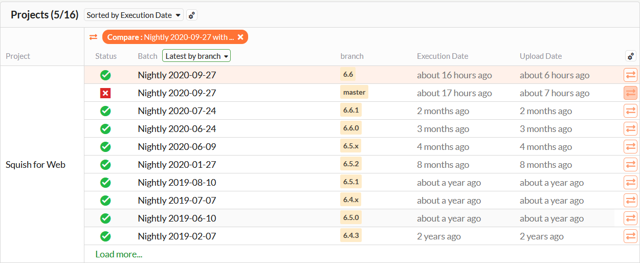
If you encounter test failures in your current development branch, you might want to compare the results quickly against the stable branch of your AUT. We've made the comparison functionality accessible directly from the project overview.
Track test health over time
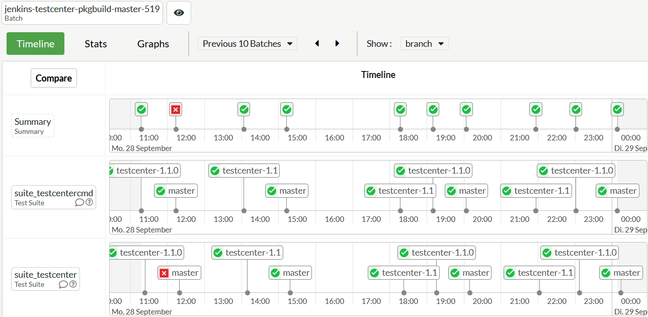
You can use the history timeline of Test Center to track the health of your tests over time. The timeline shows you all test runs in the time frame you specify and whether they passed or failed. You can use this to track down the origin of failures and to uncover flaky test cases.
You can look at the timelines of all results, or you can filter results by specific labels, to for example look at the history of a specific branch. You can also look at the history of a specific test and see for which branches the test was executed.
When you use annotations to categorize your results, those will also be displayed on the timeline.
Visualize statistics with graphs
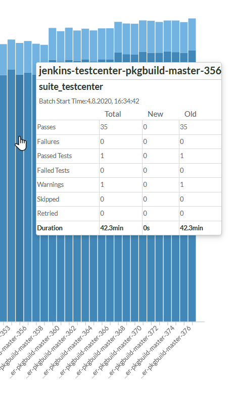
Test Center provides a very configurable graph view. For instance, it can visualize how the number of failures and passes changed over time, or how the duration of your tests changed over time.
It is also possible to combine different statistics, so you could show the number of passes next to the duration of tests, to see if a change in the duration is caused by new tests being added, or tests not being executed, or if the number of tests remained the same, it could even indicate that the performance of your test instance or AUT degraded.

The available result statistics that can be configured include the following:
- Passes
- Failures
- Passed tests
- Failed tests
- Warnings
- Skips
- Duration of tests
When you upload your Coco code coverage results to Test Center as well, the graph can also show you all of the coverage levels coco supports, as well as how the effective lines of code changed over time.
When choosing multiple statistics of the same unit you can also chose to either show them stacked or clustered.
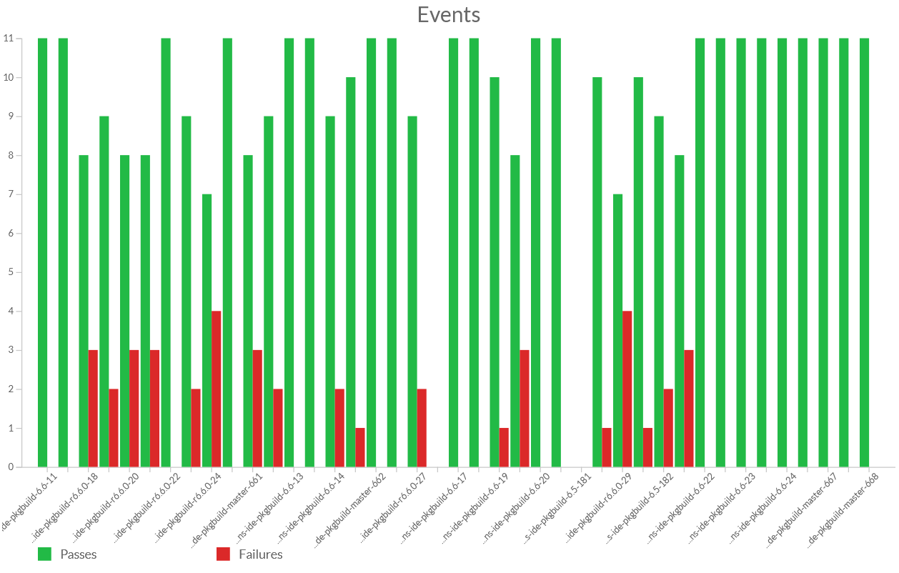
Within the Graphs page, you can view the statistics across all test cases, or you can select an individual test, scenario or step. When looking at the statistics across all test cases, you can choose to look at a single summarized value, or you can look at how much each test or label contributes to the overall value. When looking at the distribution across test items, it's also possible to drill down into the hierarchy from within the graph itself, using a mouse-click.
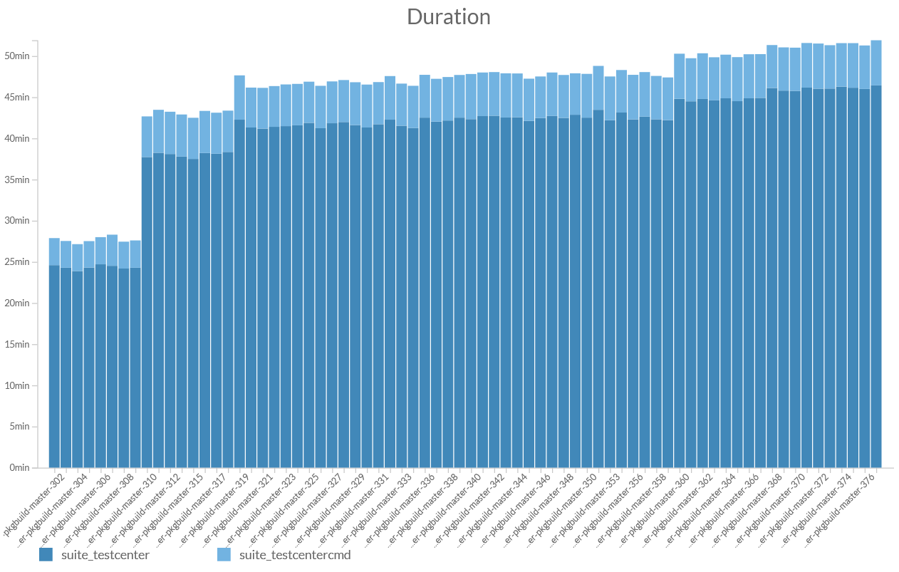
Hovering over bars in the graph will show you a tooltip that reveals detailed information about the other statistics currently not displayed in the graph.
