Qt Insight Basics Part 5: A/B Testing in Embedded Apps - User Behavior Analysis
November 23, 2023 by Indivara Weerasuriya | Comments
So far, we have explained how to register for a free trial of Qt Insight and the information that can actually be checked. This article provides some examples of how this information can be used to improve the GUI in practice.
Contents
- Field Test Optimization
- A/B Testing with Different Software Versions
- A/B Testing with Different Countries, Devices and Screen Resolutions
- A/B Testing with Slightly Different UI/UX
- Onboarding Experience Optimization
- Feature Adoption Analysis
- UI Path Analysis
- User Profiling
- Time to Value Enhancement
- Dead Code Reduction
- Application Crash Analysis
- General KPIs for Analysis
- General KPIs for Commercial Product Managers
- Typical KPIs for Technical Product Managers
- Summary
Field Test Optimization
In field testing, A/B testing is performed by having a prototype of a product actually used by pilot users, your own employees, resellers, and key customers.
A/B testing is one of the experimental methods used in many fields such as marketing, product development, and web design. In this test, two different versions (A and B) are created, and their performance is compared. The goal is to determine which version performs better against a target Key Performance Indicator (KPI).
More specifically, it is often used for website landing pages, advertisements, and email campaigns. For example, for a website landing page, a version with different button colors, text, layout, etc. is created and visitors are randomly directed to one page or the other. Then, through analysis, the page that generates more conversions (e.g., purchases, signups, etc.) is determined.
In this way, A/B testing enables data-driven decision making and helps optimize products and services.
With Qt Insight, A/B testing can be performed in the following ways.
A/B Testing with Different Software Versions
Qt Insight can display data from different application versions separately.
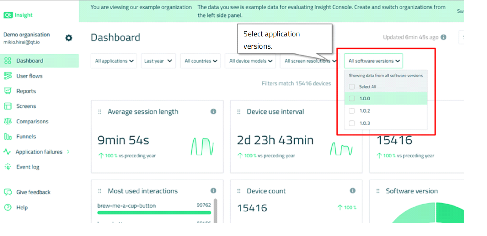
The Comparisons tab also allows you to compare data between different versions of the software, so that you can, for example, analyze the differences in user behavior after an update to the latest version of the software.
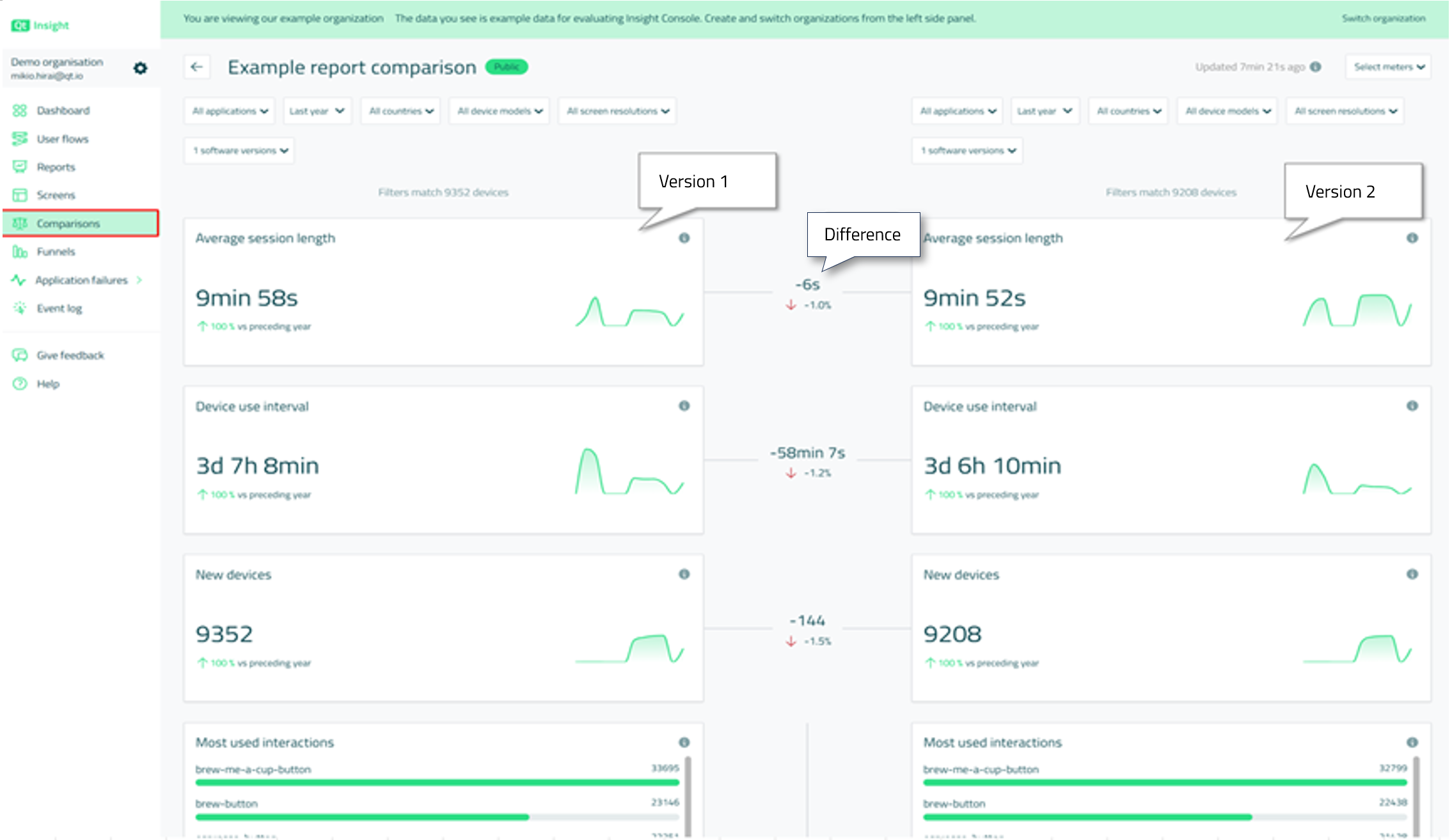
This allows us to notice the following, for example.
1. Change in average app usage time before and after the update
If a user's time spent in an app increases after a software update, we can infer that the user likes the app for some reason. We can then analyze the user flow, funnel, and time spent on each screen to see where specifically users are spending their time, which can provide insight into whether users like certain new features, for example. Conversely, if uptime has dropped significantly, the app update may be driving users away. Again, this can be hypothesized by comparing it to other information and then applying an update that tests the hypothesis with the next software version update to determine its truth.

2. Change in average app usage interval (time when apps are not in use) before and after the update
These results can also be analyzed from the same perspective as the change in average time spent using the app described above.

3. Change in number of devices before and after the update

4. Changes in operations used before and after the software update
This information allows us to determine the impact of software updates on user behavior. For example, if you change the placement or color scheme of a button during a software update, and user activity for that button increases or decreases significantly, you can answer whether the change worked as intended. If you expected to see an increase in user interaction with the button, but the opposite is true, you may need to rethink your design.

5. Changes in the most viewed screens before and after software updates
This information can also be used, for example, to confirm whether a new screen is being used as often as intended when a new feature is implemented on a new screen. Or, if the user navigation flow (order of screen transitions, etc.) is updated at the time of a software update, it is possible to determine how much of an impact this has had on the number of screens used by users. If the user is using the screen you want them to use more often, as intended by the flow change, then the update has been a success.

6. Changes in the days of the week and times of day that the application is used most before and after software updates
If a new feature is added that is likely to be used at night, and if this causes a change in the time of day users use the feature, this may be evidence that the feature has gained some popularity.

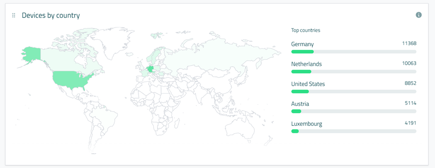
7. Changes in the regions with the most apps before and after software updates
For example, if a significant change in the number of devices by region is observed as a result of adding a new feature, it can be hypothesized that the new feature unintentionally attracted people in that region. Identifying this can lead to identifying features, UI/UX themes, etc. that should be offered to people in that region. If the number of devices in a certain region decreases due to version upgrades, it is necessary to quickly identify the cause of the decrease with other information provided by Qt Insight. If we can do this, we may be able to further increase the number of users while reducing user churn in that region.

A/B Testing with Different Countries, Devices and Screen Resolutions
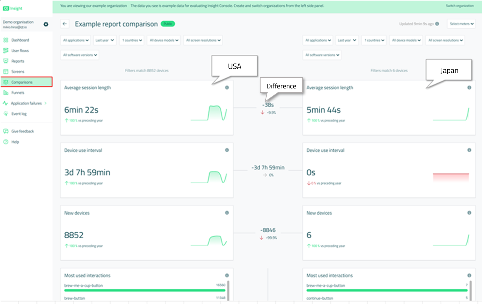
The aforementioned Comparisons tab also allows you to compare data from different regions. The example below is a comparison of user behavior in the U.S. and Japan.
In addition, Qt Insight can check information by device model and screen resolution, allowing you to analyze differences in user behavior based on these factors. The size of the screen resolution can also affect the content of the application itself, which can lead to differences in user behavior.
A/B Testing with Slightly Different UI/UX
Using OTA (Over The Air - a method of remotely updating software after a product has been shipped), you can deploy applications with slightly different button positions and UI color schemes to specific user groups of devices and analyze user behavior for each, providing feedback on what UI/UX is most effective for users. Of course, it is also possible to compare any data set across these different categories using the "Compare" feature described above.
A/B testing provides the following insights.
- Reduce uncertainty about which features and look-and-feel should be implemented in a product
- Identify differences in user behavior by market (country, culture, language)
- Identify differences in user behavior caused by differences in device specifications, resolution, operating system, etc.
Onboarding Experience Optimization
The onboarding experience refers to the process by which new users become familiar with the product and existing users become familiar with new features.
The UI/UX that a familiar user feels comfortable with is not necessarily optimal for new users. Optimizing the onboarding experience is very important to win the hearts and minds of users during their first experience.
There is an "aha" moment in the process of a user experiencing a new feature, which is the moment when the product or feature meets the user's expectations and desires.

The benefits of an optimized onboarding experience include
- Improved conversion rate from free trial users to paid users
- Improved word-of-mouth marketing effectiveness through early user discovery of exciting features that differentiate the user experience
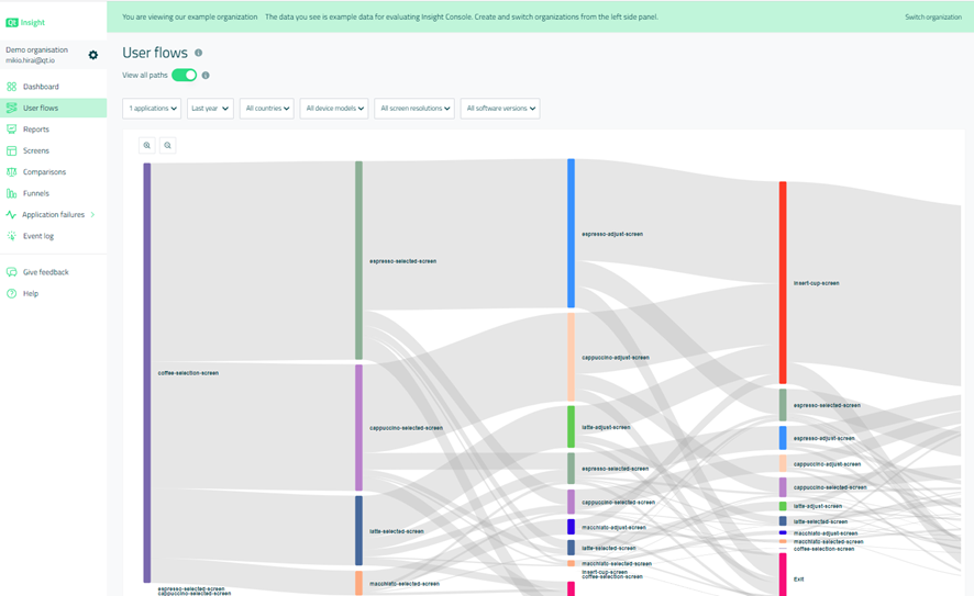
With Qt Insight, you can visually examine the flow of users as they navigate through the user interface. The user flow chart below visualizes how many users are navigating from one screen to another, and this information can be used to determine if users are actually using the new features as smoothly as the developers intended. If not, you can gain insight into what needs to be changed.
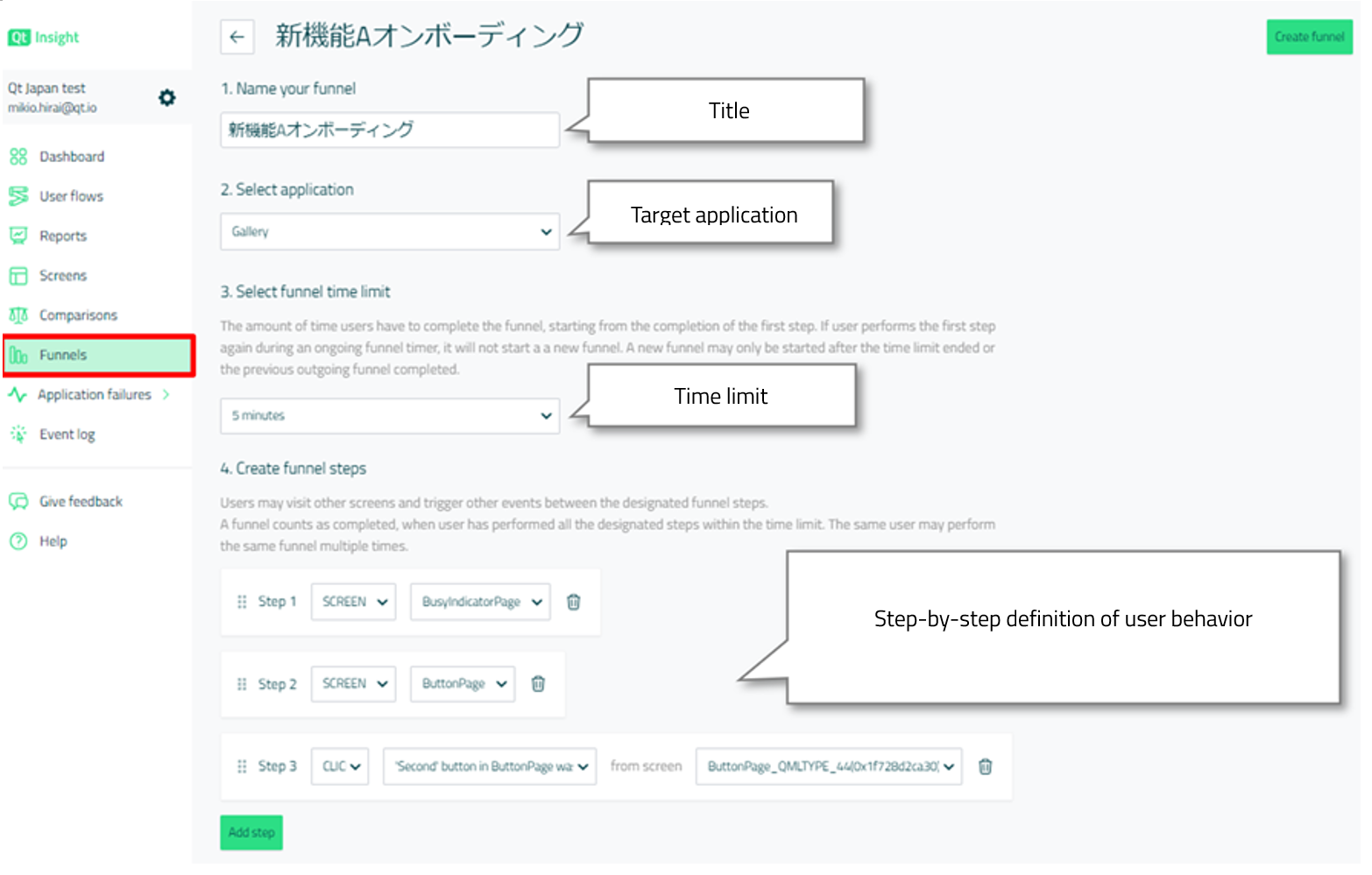
The Funnels feature can also be used to analyze how many users actually performed a specific staged user action defined in the Qt Insight Web Console within a time limit. Funnels are defined below.
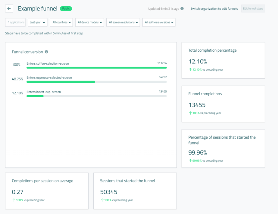
Below is an example of a funnel result. We can quantitatively see how many user sessions actually initiated the defined flow and what percentage of them followed the steps as intended. For example, when we release a new feature, we can define the funnel to that feature and the intended time limit to see if users are actually getting to that feature. If they are not, we may need to improve the structure of the screens and the order of the transitions.
By optimizing the onboarding experience, you can
- Quickly gain an accurate understanding of end-user behavior patterns
- Determine the balance between daily usage and onboarding
- Increase free trial to paid user conversion rates
- Discover and implement the best features for onboarding (wizards, tooltips, app messages and guides, etc.) without compromising the features used on a daily basis.
In general, the sooner users realize the value of a product, the higher their satisfaction and the more likely they are to continue using it.
Feature Adoption Analysis
Product managers (also called product owners) receive daily feedback on their products from a variety of sources, including their own customers, competitors, market analysts, developers, support engineers, sales, and marketing. However, prioritizing this feedback is often difficult and the feedback can be subjectively biased. In this situation, the ability to use Qt Insight to obtain quantitative behavioral data from actual users 24 hours a day, 7 days a week, 365 days a year can provide a new perspective on product analysis.
For example, you can see the retention of a particular feature by category, such as country, user group, or device model.
There are four perspectives in feature retention analysis
1. Depth of Adoption
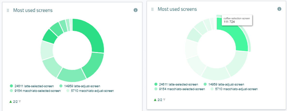
By knowing the extent to which a feature is used by users, it is possible to see how useful the feature is to users in different categories. The following example shows a pie chart that displays the percentage of screens used by users and the number of users. This data can also be viewed by category, such as country or software version.
2. Breadth of Adoption
This is the analysis of the following information
- How many users have become accustomed to a feature?
- Do they use the feature on a regular basis?
- Do only certain groups of users use the feature regularly?
- If they use it regularly, how often do they use it?
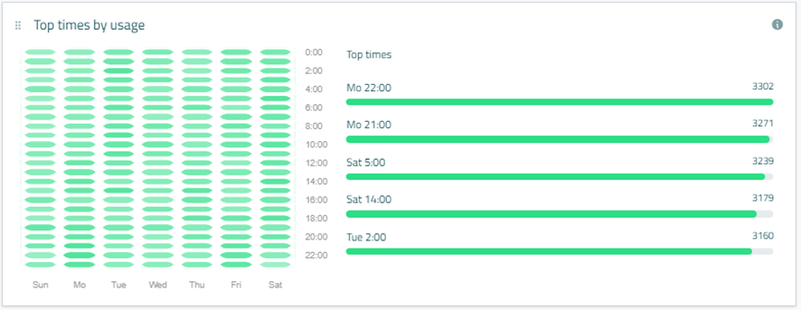
As shown below, Qt Insight allows you to see data on which days of the week and at what time the app is used most. Because the time is local to each device, you can get an idea of how users generally tend to use apps at these times, even if you are viewing data for multiple countries. For example, if you filter the data to show only Japan, you can see what time of day and day of the week Japanese users tend to use the application.
3. Time to Adoption
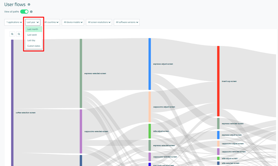
Information about how long it takes end users to start using a feature after it is released or upgraded can tell us how accessible and noticeable a new feature is to users. If users are willing to take the time to find a feature, it is more likely that the feature is meaningful to them. Conversely, a feature that is not often discovered by users can be made more visible through marketing efforts, which can help determine what marketing activities should be implemented. The User Flows feature allows you to set the target time period, as shown in the image below, so you can check the degree to which users are reaching the new feature when it is added.
4. Duration of Adoption
This indicates whether the user finds enough value in a feature to use it for an extended period of time each day.
Qt Insight provides a pie chart that shows which screens (features) are used the most.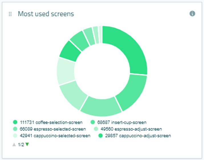
It also provides information on how much time users spend on average using the application.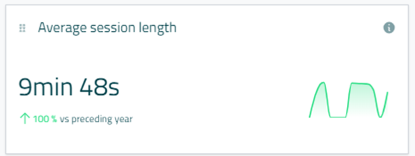
Functional retention analysis provides the following benefits
- Raw user data collected on a daily basis, allowing for a more optimized and meaningful roadmap
- The impact of individual features on user usage of the application (how many users are using each feature, identified in "Most Used Screens", and how are they using them, identified in User Flows), allowing you to estimate the impact of bugs and guide which bugs should be prioritized for fixing.
- Identify features that are used specifically by certain user groups
UI Path Analysis
UI path analysis can reveal perspectives not visible in functional retention analysis; with Qt Insight, you can visually see which paths users take to navigate the UI from the home screen, how many users take which paths, and how they explore the application from launch to exit. The funnel feature described above is also useful for UI path analysis.
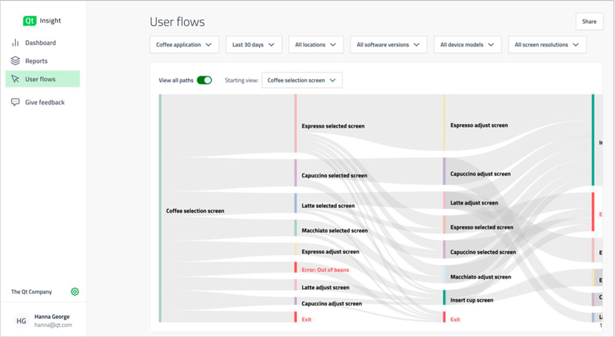
UI path analysis is also useful for UX designers. It provides guidance for designing applications that consider not only the UX from the micro perspective of each screen, but also the UX from the macro perspective of the entire application. The best GUI applications are optimally designed, reflecting the designer's intent not only in the UI/UX of each screen or component, but also in the flow of screen transitions.
User Profiling
A company's intended user base may differ from its actual user base, and real-world data can provide information to improve marketing, pricing, and UI design. While Qt Insight anonymizes the information collected for privacy reasons, the following data can be used to help identify user demographics.
- Country information
By reviewing information about the country in which the app is used, it is possible to estimate how much purchasing power the user has. - Device type, screen resolution
Device type can help infer a user's age, gender, and purchasing power. For example, we can infer that MacBook users have high purchasing power. Users of embedded devices with high-resolution displays can be assumed to be more likely to make additional investments in subscription-based premium features. - The number of sessions (number of app launches), duration of each session, and number of user interactions can be used to estimate user personas. This information can then be used for pricing decisions, product positioning, roadmap development, etc.
Time to Value Enhancement
If a product has excellent onboarding and many features, but users stop using the product after a trial period or free version, there may be something wrong. This problem is often attributed to "time to value (TtV).
Time to Value (TtV) refers to the time it takes a customer to get actual value from a product, and product analytics can help shorten TtV by tracking events and user interface paths. What is actually tracked depends on the nature of the product.
If it turns out that users do not immediately find value in the product, you should consider optimizing the UI and configuring it to make it easier for users to get value, or adding features to deliver value more quickly. Some products (e.g., apps for quarterly financials) are slow by nature to show value, in which case a simulation based on historical data may provide significant value quickly.
Qt Insight can help you to optimize the user flow and funnels to ensure that you are getting the most value out of your product. Qt Insight can provide insight into the extent to which intended value is being realized for users through the use of user flow and funnels.
Dead Code Reduction
According to a study by Technical University Munich, 25% of enterprise software is dead code (Research of Technical University Munich, "How Much Does Unused Code Matter for Maintenance?", 2012). Other studies have shown that 80% of code in cloud solutions is rarely used by users (Study of Pendo.io, "The 2019 Feature Adoption Report," 2019).
Dead code here is not limited to "structurally unreachable code" or "uncalled functions" as identified by static analysis tools. Functions that are rarely or never used by the user (not found or not needed) can also be considered dead code.
If 25% of the source code does not actually make sense, then the product and the development team have a huge burden on their shoulders. Because these dead codes are not recognized as dead codes, they remain in the product even though they are not used, and in the meantime, the product must continue to spend money and man-hours on development and maintenance.
Some examples of maintenance include upgrading third-party libraries in dead code sections, performing security and penetration tests, creating and performing unit and GUI tests, and supporting version upgrades of programming languages and compilers.
Because it is not a function that is used, of course, no bug reports are filed and no one notices that it is dead code, leaving the company to spend its resources without a second thought.
Of course, dead code also has a negative impact on memory footprint.
Qt Insight can help identify dead code by providing insight into which features users are actually using and which are not.
If a feature that is considered dead code is actually a feature that users want to use, then the intended value experience can be provided to users by discovering and improving the feature. On the other hand, if you can discount dead code as an unnecessary feature, you can increase your return on investment by focusing development resources on the features that are more popular with your users. By using resources efficiently, you may be able to get the most out of a smaller investment.
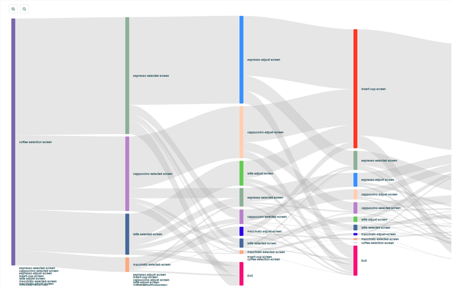
Dead code analysis using Qt Insight can provide the following benefits.
- Improved software comprehension, testability, and maintainability (removal of unused code and functionality)
- Improved UI/UX by identifying features that users want to use but do not
- Combined with structural dead code analysis provided by static analysis tools, comprehensive dead code removal is possible.
Application Crash Analysis
Qt Insight makes it possible to analyze application crash (abnormal termination) information; the Qt Insight Tracker listens for the QCoreApplication::aboutToQuit signal, and if this occurs, the application is considered successfully terminated.
In the Application failures tab, you can see information about crashes that actually occurred while users were using the application within a certain period of time, as shown below.
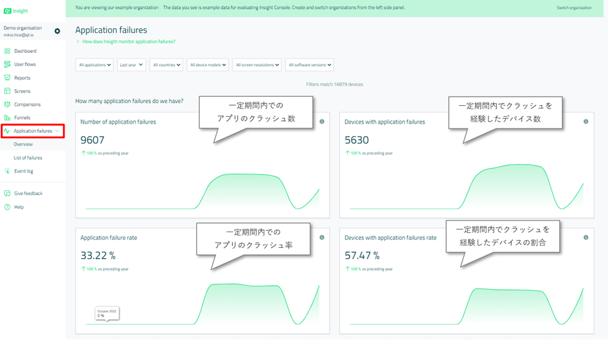
The Application failures tab allows filtering by country, software version, device model, screen resolution, and software version. Such filtering makes it easier to identify the cause of crashes.
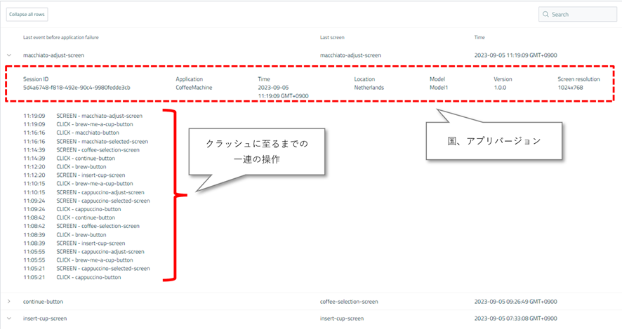
You can also see the UI paths that lead to application crashes, as shown below.
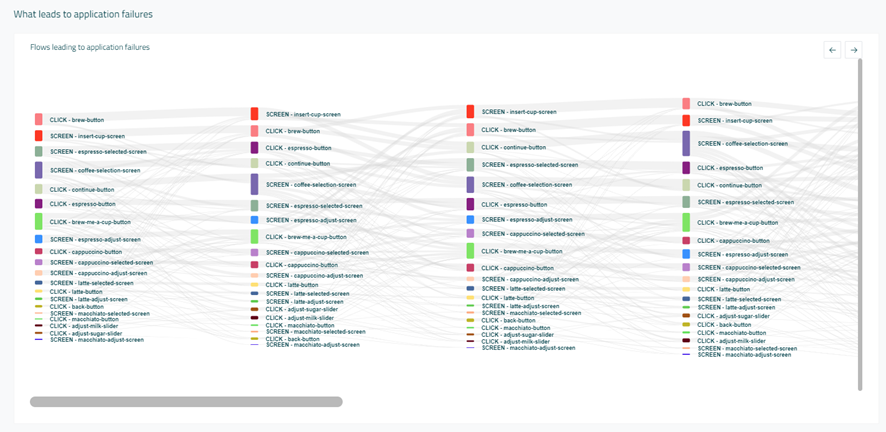
In addition to the user flow leading up to the crash, the ranking of "Interactions that lead to application failures" and the ranking of "Screens that have the most application failures" can also be checked.

In addition, you can view trace information about when, where, and through what operations individual crashes occurred. Market-reported crashes are often difficult to reproduce. In these situations, the sooner we can identify reproducible conditions and quickly fix the application, the faster we can improve the quality of products.
General KPIs for Analysis
Finally, here are some KPIs that are commonly applied by product managers when analyzing user behavior.
KPIs for Commercial Product Managers
- Number of new users per week - to determine demand for the product.
- Number of inactive users per week - to see how well users are being retained.
- User segments - understand your users by the number of users per category, such as country, device, version, etc.
- Identify frequently used features - how many user interactions were there for a feature in the last 12 months? Which features are used most? - Determine which features to focus on.
- To what extent and which features are used by users with high purchasing power - Such features could be treated as a paid version.
KPIs for Technical Product Managers
- Feature adoption - Percentage of users per feature. Which features are used the most? How often are they used?
- Feature Usage Frequency - How often is a feature used? Compare to your own assumptions.
- Time to Adopt - The time it takes for users to adapt to a new feature.
- Time to Adopt - the time it takes for new users to become comfortable with the application.
- What days of the week and what time is it used most? - Is the feature used every day? Only in the evening? Only during the commute?
Summary
This is a rather long article, but these are some practical examples of how Qt Insight can be used. Depending on your ingenuity in analyzing data, you may be able to improve your GUI application from various perspectives other than those mentioned above.
We hope we can help you build the best products using Qt Insight!
In the next article, we will finally show you how to send data from your application to Qt Insight.
Articles in this series
- Qt Insight Basics Part 1: Visualizing User Behavior for Optimal Product Design
- Qt Insight Basics Part 2: Getting Started 1 - Free Trial Registration
- Qt Insight Basics Part 3: Getting Started 2 - Analyzing User Flows
- Qt Insight Basics Part 4: Getting Started 3 - Funnel Analysis and Crash Analysis
- Qt Insight Basics Part 5: A/B Testing in Embedded Apps - User Behavior Analysis
- Qt Insight Basics Part 6: Sending Data to Qt Insight
Blog Topics:
Comments
Subscribe to our newsletter
Subscribe Newsletter
Try Qt 6.8 Now!
Download the latest release here: www.qt.io/download.
Qt 6.8 release focuses on technology trends like spatial computing & XR, complex data visualization in 2D & 3D, and ARM-based development for desktop.
We're Hiring
Check out all our open positions here and follow us on Instagram to see what it's like to be #QtPeople.
.webp)


