Cleaning up styles in Qt5 and adding Fusion
October 30, 2012 by Jens Bache-Wiig | Comments
Qt has traditionally strived to provide a native look and feel on all its target platforms and does not really have a strong visual identity of its own. This will not change in Qt5. However Qt also used to ship with a whole range of extra styles as well. With the modular nature of Qt5, it is clear that including over six different and mostly outdated non-native look and feels in every single deployment of Qt is a rather silly thing to do. After all, how many times have you had the need to see how your application would potentially have looked on an early 90's solaris workstation? It is about time that we clean some extra baggage from the base install of Qt.
The styles we are primarily planning on removing are Motif, CDE, Cleanlooks and Plastique. If Windows (classic) is still going to be provided as a cross platform style is still up for discussion as there are still some dependencies that would need to be sorted out first.
We are also planning to remove the remaining style headers from the API itself to make it possible to replace or remove deprecated platform styles in the future. QStyleFactory and QProxyStyle will of course still allow you to create and modify them without hard dependencies.
Before anyone panicks, keep in mind that we are simply removing them from the base install of Qt5 so that every single deployment of Qt will not have carry the extra baggage. Applications or developers that need or use them for specific purposes will still be able to get them as plugins from a new qtstyleplugins project repository


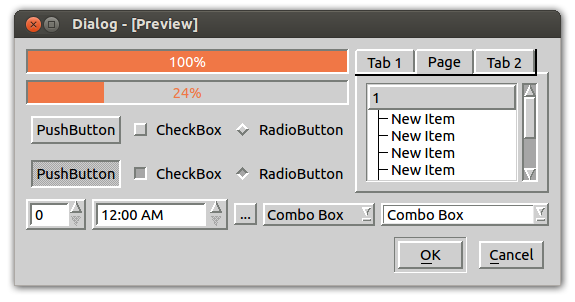
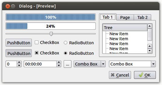
The old Motif and Plastique styles - No longer included
We know that there were a few reasons why certain applications would chose to use these styles instead of the native theme. They could sometimes provide better support for custom colors and they make it possible to have the same look and feel across multiple platforms. On the other hand they were all starting to look rather dated and would have needed a complete rewrite if they were going to support new features like scalable UIs or retina displays.
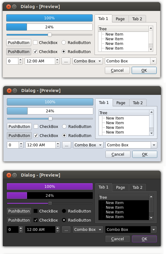
Given those use cases, I thought it would still make sense to have a simple non-native look and feel with Qt that could handle all these use cases but look a bit more fresh and up-to-date. We aimed for a clean look that puts focus on the content, rather than trying to stand out on it's own so that it could be used in a wide range of contexts. The result is Fusion style as shown in a few different color configurations here.:
Fusion Style - New in Qt5
Blog Topics:
Comments
Subscribe to our newsletter
Subscribe Newsletter
Try Qt 6.10 Now!
Download the latest release here: www.qt.io/download.
Qt 6.10 is now available, with new features and improvements for application developers and device creators.
We're Hiring
Check out all our open positions here and follow us on Instagram to see what it's like to be #QtPeople.


