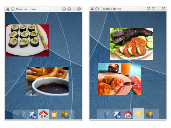
I have shown parallax sliding example long time ago. It was certainly inspired by the increase use of such an effect in the so-called home screen, typically in the mobile platform. Since there has been also an increase interest on Qt for Symbian example programs, I decided to recycle that old example and to turn it into something that fits the form-factor and user experience on the phone. Thus, the demo is (re)born.

The code is in Graphics Dojo repository, find it in the parallaxhome subdirectory. For a touch device, you can tap on the icons on the bottom bar to switch between different pages (enjoy the subtle bump effect of the icons). With a non-touch device, left and right arrow keys are your friends. The heart of this parallax effect is the difference of speed between the graphics items (those wonderful food photos) and the background. The above screenshot demonstrates that exactly: on the right side, although now the page (with the weather icon) has been shifted from the center one (with the home icon), you can see that these two pages mostly share the same background portions.
Exercise for the reader: use the panning trick to shift between one page to another. If you feel brave, add some kinetic effect, too.
As a last note, this will be my last Graphics Dojo example. For future Qt-related code examples, please check my personal blog on a regular basis (e.g. just track the posts tagged with qt).
May the training spirits be with you! Namárië.


